Early Screen Work
I have been using illustrator to mock-up some final designs for my leaflet.
The Colours

The Front Cover


I have designed the front cover to be eye-catching and incorporate the colours shown above. I have kept the information simple and also added the QR code onto the front to make it easily accessible for the user.
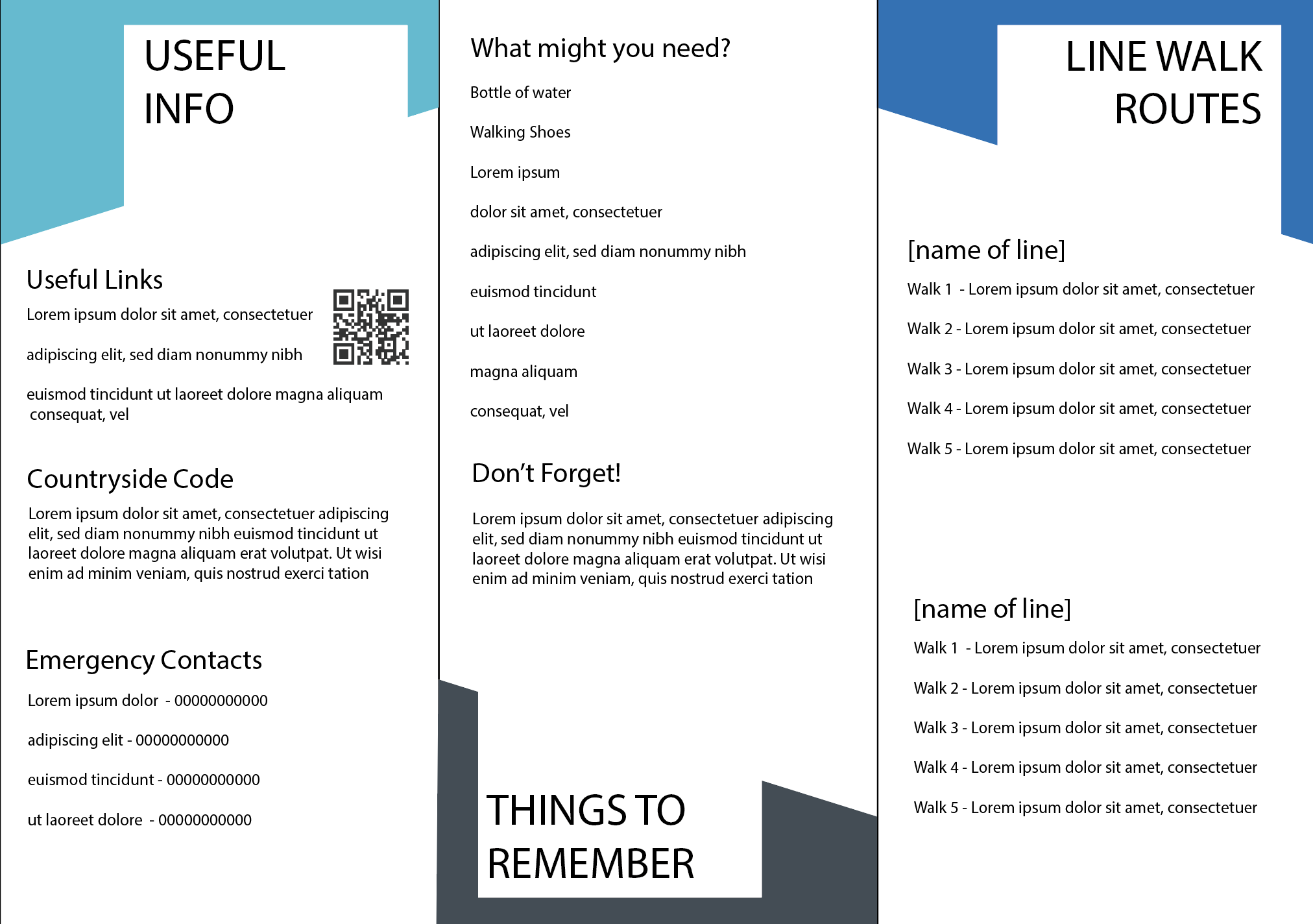
Inside Content

Maps


Drawings
To develop my work further I have decided to use illustrations. When I spoke to the client I asked if they wanted to use photographs or illustrations. The response I got was fairly open, however they stated that using illustrations may help the leaflet to work well alongside already existing work which uses illustrations. Below are the illustrations I have constructed to use within the leaflet:


Comments
Post a Comment