Wayfinding + Signage Design - Class Task Notes
Navigation
- When you get lost you need to be able to navigate back - in the old days, if you got lost it could be the end as you couldn't get back to your cave etc.
- Wayfinding is a specialist design area that combines science, psychology, semiotics and graphic design skills.
Animals
- Animals have a built in sense of direction, homing instinct, ability to migrate back to nests/hives etc. (this is through iron fillings in their frontal lobes, they have a better idea of where magnetic north is)
Humans
- Humans have developed their own methods of navigating using mainly memory and logic, we used to be better at finding where natural north is, we have a little bit of iron in front of forehead, but not enough, it has been grown out as we don't really need it anymore.
- Navigation can be done through landmarks, a river, hill, building, shops etc. This is how humans now give directions "go past the McDonalds and turn right..."
- Australian aborigines used song lines, a list of landscape features to describe their paths in the outback
- Drovers (who herd cattle) would plant pine cones to grow trees to use them as navigation markers and also as "reviews" for farms, the more trees the better the farm
Transport
- Transport brings different navigational needs, how to get to the right platform, shop or which road to take.
Good Wayfaring Design
- Good wayfaring design is almost invisible, we don't notice them, they just work.
Graphical Language:
- Audience - graphical language that is obvious to people
- Location of wayfinding - needs to be in correct place, who is it for? Driving, walking?
- Critical signage - emergency signs, needs to be effective in a short period of time, needs to speak visually
- Ways human beings use to get to places and to get back
Zones and How They Work
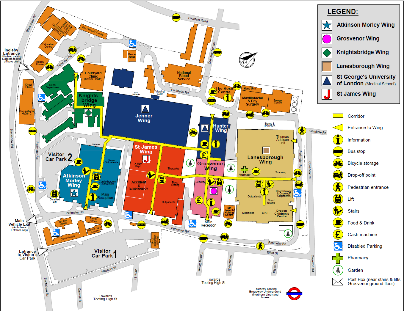
- Create different zones in a building (such as a hospital), with have a different feel to them, this makes it easier to remember where to go.
- Lighting, wall colour, floor finishes, prints or even plants and sculptures can help create enough of a difference to help differentiate.
- Place-Cells in your head - like GPS trackers and when you return to a place you are familiar with it
- Clear numbering, nomenclature and directional icons, arrows and the evolving mental map becomes even clearer.
Types of signs
- Orientational - maps, exploded views, plans, landmarks
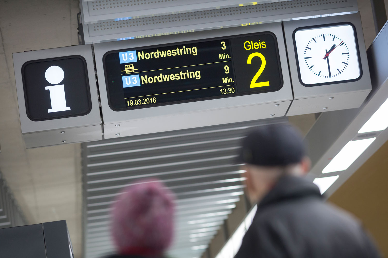
- Informational - time-tables, industrial estate boards
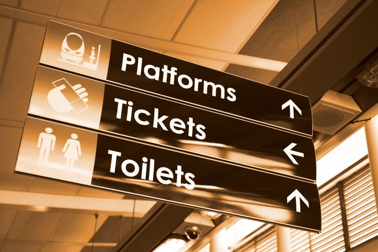
- Directional - navigational systems (hospitals, airports)
- Identificational - buildings, works of art
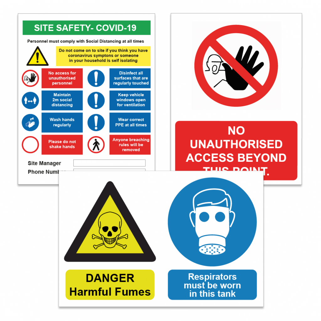
- Statutory - rules, safety signs, legal notices, (fire regulations)
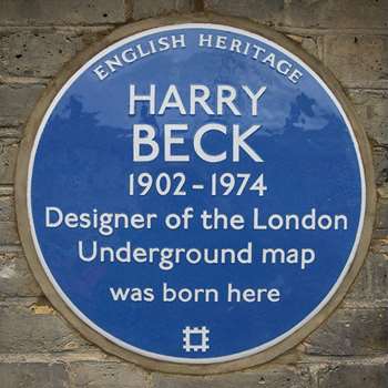
- Ornamental - banners, flags, commemorative plaques.
Signage collection task - Examples of all 6 signs
Key Issues for Good Signage
- Style of sign (type, colour, proportions)
- Keep it Simple (roadsigns sign needs to be clear)
- Legibility (appropriate for audience, cars, pedestrians etc.)
- Typography (Uppercase and Lowercase easier to read, ideally Sans Serif



Comments
Post a Comment