Graphic Design for Print - Week 1 Learning Journal
Element Chosen: Road Signage System - Jock Kinnier and Margaret Calvert
WHO, WHEN + WHY
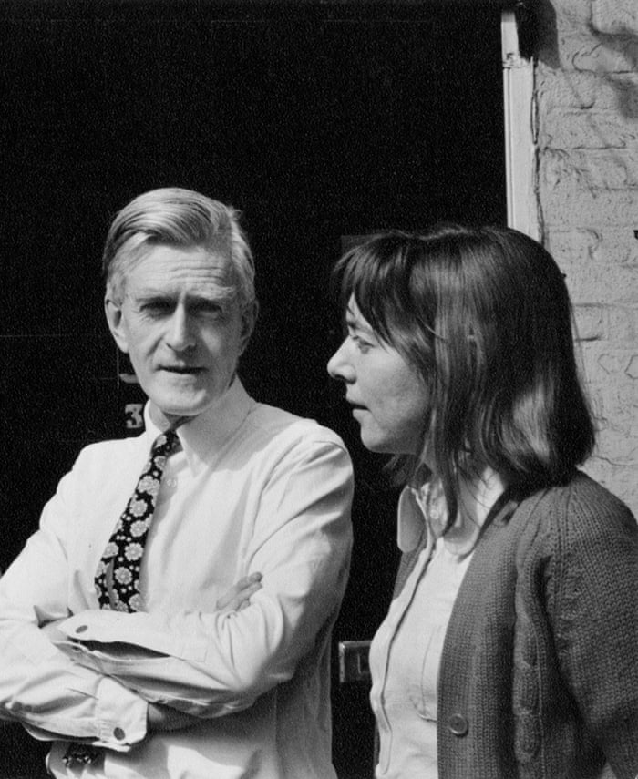
In 1965 British designers from London Jock Kinnier and Margaret Calvert launched their road signage systems all over the UK. This was after a series of photos graphic designer, Herbert Spencer, published in his magazine Typographica in 1961. He published the images to show how confusing the road signs used to be around London, specifically Heathrow. This sparked the government giving Kinnier and his assistant Calvert the job to redesign the British Roadsigns.
HOW
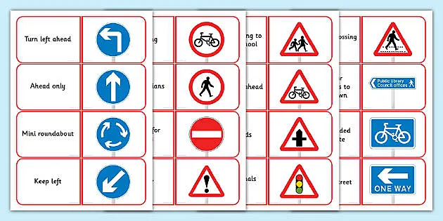
They used 2 type faces, the motorway and transport typefaces. Both mix upper and lower case letters which helps the words on the sign get recognised faster. It is not always appreciated that the size of lettering used on traffic signs varies greatly depending upon the speed of traffic and how much information is shown. Other elements of the sign need to be scaled accordingly. There are also 3 basic shapes of British road signs to help users identify the signal quickly:
The circles give orders and must be followed to stay within the law. The triangles warn users of any hazards or road layouts that lay ahead and the rectangles inform wether this be information on motorways, primary roads or directions on a minor road.


Comments
Post a Comment